
Album Collage Maker: How to Design and Export Music Grids
You know the feeling. You open your streaming history, stare at a wall of album covers, and think it'd be nicer if all that taste stopped living in tabs and started living as one tidy little grid you could admire. An album collage maker is basically the sane version of that impulse, which is to say: a controlled experiment in turning months of listening into something that looks deliberate instead of like your library got into a fight with a laminator.
The format makes sense because people already understand collage as a visual language. A mainstream collage app listing on the Apple App Store showed roughly 400,000 estimated downloads in the previous month and about $200,000 in monthly revenue, with in-app purchases from $4.99 to $69.99 per item, plus chart positions across iPhone and iPad categories, which is a solid sign that visual composition tools have real consumer demand, not just hobbyist energy (Sensor Tower listing). Music collages fit that same habit, only the raw material is album art instead of selfies, dog photos, or that one picture of your lunch that somehow became the moral center of your camera roll.
Why Album Collages Became a Thing
The jump from photo grids to music grids happened because streaming services gave everyone a ready-made archive of taste. Once you've got years of listening history, the urge to see it as a pattern is hard to ignore. Album covers are ideal for this because they're already standardized visual objects, small enough to tile, distinct enough to recognize, and weirdly good at making your personality look curated even when half your listening was done while folding laundry.
From listening history to visual summary
By the late 2010s and early 2020s, generators were already making collages from Last.fm charts and Spotify listening data. Tools like Tapmusic and Riffology built around Last.fm, while Collageify grouped recently played Spotify songs by album and ranked those albums by recent listening activity. That shift matters because it turned collage from a static design exercise into a data-driven summary of taste. You're not picking covers because they match a colour palette, though that's absolutely part of the fun. You're also letting your listening history say, with all the subtlety of a neon sign, "yes, I did spend three weeks in an ambient dungeon."
Practical rule: if the collage is about your taste, the data should do most of the heavy lifting, then your eye should do the cleaning up.
A useful place to compare the generic photo-grid mindset with a more intentional layout is starryai's photo tool, especially if you're trying to understand how collage software handles visual balance before you commit to a music-specific workflow. The important thing is that album collages are not a novelty anymore. They sit at the intersection of streaming culture, social sharing, and the old human joy of arranging tiny rectangles until the tiny rectangles stop looking like a mistake.
Planning Your Layout Before You Start Dragging
Most bad collages fail before a single cover gets placed. The mistake is opening the tool, dragging in a pile of albums, and hoping the grid becomes art through sheer optimism. It usually becomes a mess with opinions.
Decide the grid before the albums
Start with three decisions, in this order. First, choose the grid dimensions. A 3x3 feels like a tight statement piece, a 4x4 gives you breathing room, and a 5x5 starts behaving like a data wall, which is fine for some uses and a crime scene for others.
Second, choose the album count. Fewer albums usually makes a better design because each cover stays readable. That's especially true on wallpaper or print, where tiny cover art turns into decorative confetti if you cram too much into the frame.
Third, decide the destination. Social posts forgive a denser grid because people view them fast and small. Desktop wallpapers and prints need legibility at arm's length, which means your grid has to work harder and your covers need more space. If you want a concrete mental model for a phone-first layout, the guide on how to make an iPhone home screen aesthetic is a useful reminder that screen size changes everything.
Practical rule: if you can't recognize an album cover at a glance in your mockup, it's too small for the job.
Tool limits matter here too. Some collage apps cap you at 9 images, others support 10 photos, and the open-source Album Collage project lets users select up to 30 albums from Last.fm while generating shapes dynamically for each possible album count (Perfect Corp, Picsart, Album Collage on GitHub). Those caps aren't just technical trivia, they decide whether you're making a compact statement or a tiny museum of your listening habits.
Selecting and Sourcing Album Covers
There are two sane ways to gather album art. The first is to let a generator pull from your streaming history or library. The second is to curate manually like you're assembling a very small, very judgmental gallery wall. Both work. They just reward different kinds of patience.
Generator speed versus manual control
Data-driven generators are fast, and they're honest. If your Spotify history has three months of sad synths and one suspicious detour into yacht rock, the collage will rat you out immediately. That can be brilliant, because the whole point is to visualize actual listening, not your ideal self who only consumes Scandinavian jazz and rain noises.
Manual curation gives you control over colour, contrast, and narrative. If you want the collage to feel cohesive, you can pick covers that share typography, palette, or visual density. That's the route to take if the final piece is going on your desktop or in a print frame, where aesthetic consistency matters more than algorithmic purity.
Clean up the ugly edge cases
Duplicate albums are the first annoyance. You don't need three versions of the same cover unless the design is explicitly about repetition. Missing artwork is next, and it's worth replacing blanks instead of pretending the void is a design choice. Low-resolution covers are the sneakiest problem, because they can look fine in a picker and then go blurry once they're tiled into a grid.
A useful trick is to keep a shortlist of backup albums before you start. If a cover is muddy, too dark, or visually noisy, swap it out early. The collage should feel edited, not merely assembled.
One nice thing about tools built on actual album counts is that they can adapt shape to content instead of forcing one template onto everything. That's why some generators feel less like drag-and-drop and more like a layout engine wearing a record collector's cardigan.
Privacy and Data Handling You Should Know About
The part most collage guides skip is the bit that matters most when the tool connects to your music account. If a generator wants access to your Spotify or Last.fm history, that's not just a convenience feature. It's a data-handling decision. And yes, the pretty result is often what gets the attention, which is exactly how people end up approving permissions they'd never grant if the dialog box had better typography.
Read-only is better than mystery access
The first question to ask is simple. Does the tool need full access to your library, or just enough permission to read the listening data needed for the collage? If the answer isn't obvious, that's already a warning sign. Prefer read-only permissions when they're available, and revoke access after you've generated the image if you don't need the connection anymore.
You also want to know where metadata lives. Some tools process everything on the server, others lean on exported files, and some may keep enough information around to make the experience feel convenient without being especially transparent. A good privacy policy should explain what's stored, what's temporary, and what can be deleted. For a reference point on how a product can at least spell out its data handling, Walling's privacy details are a useful example of the kind of clarity users should expect, even when the product itself isn't music-related.
Private collections and disappearing APIs
If you want a collage from a private collection without publishing it, make sure the tool supports that workflow. Don't assume it does just because the interface looks friendly. API-driven collage tools are especially fragile here, because if the source changes or disappears, your old workflow can break without much warning.
Practical rule: if the tool can't explain what it does with your music data in plain English, it's probably not the one to trust with your listening history.
The safest pattern is boring in the best way. Use the least permission possible, generate the collage, save the file locally, and move on with your day like a person who has not accidentally handed a startup the keys to your entire emotional canon.
Export Settings for Social, Wallpaper, and Print
Collages usually betray themselves. They look crisp on a phone, then collapse into mush on a Retina display or come out of the printer looking like a poster made of soup. Export settings aren't glamorous, but they're the difference between "nice" and "why does the text on that cover resemble a potato."
Match the file to the destination
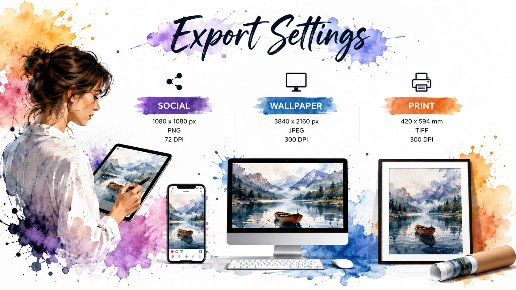
For social media, a square export is the default move. Use 1080 x 1080 for a clean, practical file, or 2048 x 2048 if you want more future-proofing and sharper re-use later. A square grid also tends to keep album covers evenly balanced, which is why it's the least dramatic option and often the best one.
For desktop wallpaper, match your display resolution instead of guessing. A good baseline is 2560 x 1600 or higher, then size the album covers so the design still reads from a few feet away. If you want the wallpaper to feel intentional rather than busy, leave some breathing room. A grid that's gorgeous on a phone can become visual static on a large monitor.
For physical prints, use 300 DPI minimum. That matters more than people think, because print exposes every sloppy shortcut. A 4x4 grid on an 18x24 poster needs each cover at roughly 1350 x 1350 pixels, which is the sort of number that teaches humility very quickly.
If you want a quick reference for Mac-sized output, the page on MacBook wallpaper size is the sort of practical note that saves you from exporting the wrong rectangle and calling it a creative choice.
Practical rule: never export at screen resolution and hope upscale will save you. Upscale is not a magician, it's a polite bandage.
Keep the grid readable
As a rough design instinct, the smaller the destination, the denser the grid can be. The larger the destination, the more space each album cover needs. That's why a collage can feel tidy on Instagram and unbearable on a desktop, even when the exact same covers are used.
If a title, logo, or or face on the album art can't survive the final output size, reduce the number of albums or enlarge the canvas. The point is not to show every record you've ever loved. The point is to make the ones you chose visible.
Turning Your Collage Into Desktop Art
A collage is doing its best work when it sits somewhere you'll see it. The obvious place is your Mac desktop, because that's where the thing gets to be decorative and vaguely self-incriminating at the same time. A grid of album covers can look excellent as a still wallpaper, especially if the covers share a palette or all belong to the same mood, like sleepy electronics, midnight synths, or whatever genre of music you call "I need to pretend my inbox is a mountain cabin."
Match the mood, not just the file
If the collage leans lofi, the wallpaper can lean into that softness with a matching animated scene from the lofi wallpaper collection. If it's all glowing typography and nocturnal energy, the neon wallpaper collection plays nicely with that palette. Darker album art also pairs well with the dark wallpaper collection, which is convenient if you like your desktop to look like it knows where the good cables are hidden.
A still collage is already a decent flex. A live wallpaper next to it makes the whole setup feel considered instead of accidental.
Make the desktop and lock screen part of the same idea
When the lock screen, desktop, and screen saver all feel like they belong to the same visual family, the machine stops looking like a machine and starts looking like your room, only flatter. That's the appeal of a wallpaper system that treats the Mac's native live-wallpaper behavior as the point, not an afterthought. If you want the practical mechanics for changing your Mac background, the guide on how to change wallpaper on Mac is the right companion piece.
The nice part is that you've already done the hard thinking with the collage. The desktop just needs to carry that same care without turning into a museum label. Your music library got organized. Your screen deserves the same courtesy.
If you want your Mac to match the same taste level you put into a collage, gifPaper makes that absurdly easy. It sets live wallpapers on your lock screen, desktop, and screen saver, so the mood on your screen can keep pace with the mood in your library. Give it a look if you want your desk to feel a little less like software and a little more like a very tasteful secret.