How to Make iPhone Home Screen Aesthetic in 2026
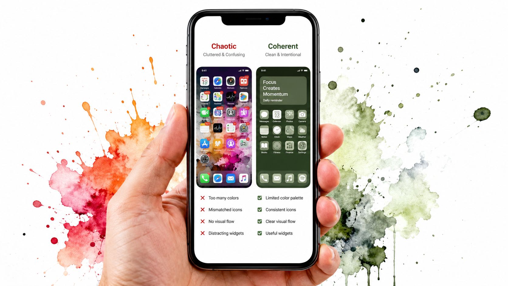
You've already done the ritual. You opened your iPhone, stared at the home screen, and thought, this looks like five people decorated it in a blackout. One icon pack says "serene minimalism," another says "I downloaded shortcuts at 1 a.m. and paid for it emotionally," and the wallpaper is fighting the widgets like it's auditioning for a security camera feed.
The fix is not another icon pack. The fix is treating the home screen like a tiny design system, with a palette, icon treatment, and widget rhythm that agree to be in the same room. Apple's newer native controls do most of the work now, which is annoying if you spent 2021 building a shrine out of shortcuts, but very good news for everyone else.
The Aesthetic Home Screen Problem Nobody Admits
Most iPhone home screens look messy for a boring reason, not a moral one. No one teaches people to think in layers, so they end up with a wallpaper, a few widgets, and a pile of apps that all came from different visual universes. The result is less "aesthetic" and more "I found this under the sofa and it still works."
The clean look people want is usually built from three decisions, not thirty. You pick the background, decide how the icons should behave, and place widgets where they support the composition instead of barging in like an uncle at a wedding buffet. That's the whole trick.
Practical rule: if your screen needs an explanation, it's not finished yet.
Apple's current Home Screen controls make this much easier than the old shortcut era, when users had to fake almost everything by hand. Now the interface itself can be styled more directly, so the goal is to stop decorating around the system and start shaping the system itself, which is a much less annoying way to spend an evening.
For a broader look at how style gets learned and repeated, this piece from gifPaper's culture notes is a useful companion. It's the same basic idea here, just with fewer berets and more app icons.
Build a Three-Color Palette Before You Touch Anything
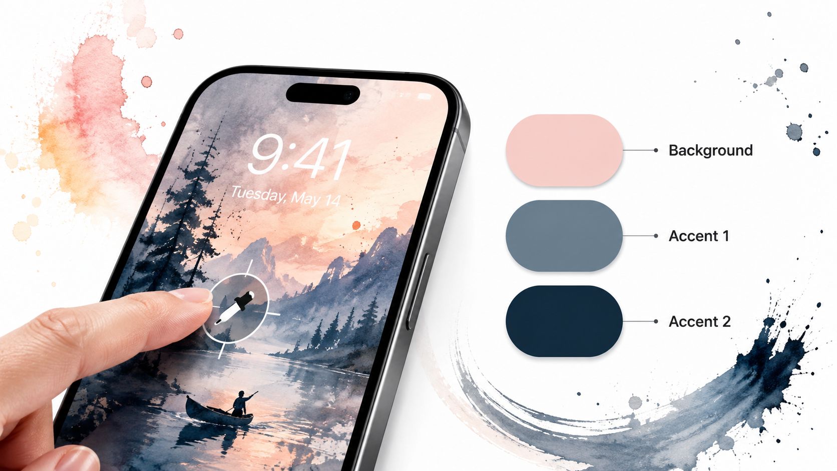
Start with three colors, not eight. One should come from the wallpaper background, one can drive the icon tint, and one can act as the secondary accent for widgets or tiny highlights. Anything more and the screen starts looking like a craft fair table that wandered into a design seminar.
Apple's Home Screen customization supports Dark, Clear, and Tinted icon and widget appearances, plus an Auto mode that switches between light and dark styling by time of day, and an eyedropper that samples a tint directly from the wallpaper. That eyedropper is the least glamorous but most useful feature in the whole setup, because it removes guesswork and keeps the palette honest.
If you want the screen to feel intentional, make the wallpaper the source of truth. Pick a tone from it, sample that tone, then let the rest of the interface obey. That gives you cohesion without the usual hobby of arguing with yourself over whether the icons are "close enough."
Design rule: a small palette reads as a system. Too many colors read as indecision with a charger attached.
This is also where you avoid the classic failure mode of trying to match every single thing. Don't. Match the major surfaces and let one or two elements breathe. The screen looks better when it's consistent, not when it's been color-matched by a very anxious moth.
Choose a Wallpaper That Actually Supports the Palette
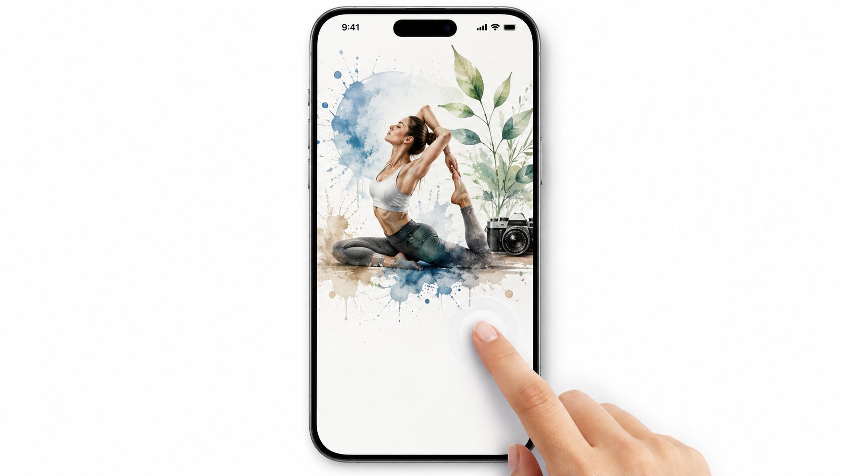
The wallpaper isn't decoration. It's the floor plan. If it's too busy, everything on top of it becomes visual static. If it's too flat, the screen can start feeling like the inside of a dental brochure.
Apple's wallpaper workflow is straightforward, which is almost suspicious. Go to Settings > Wallpaper > Add New Wallpaper, then adjust the supporting elements before you tap Add or choose Set as Wallpaper Pair or Customize Home Screen. You can also long-press the background to enter Home Screen edit mode, which is the fastest way to stop pretending the setup process is some hidden ritual.
A good wallpaper for an aesthetic Home Screen has three things going for it. It should support the palette you already chose, leave enough negative space for icons and widgets, and avoid heavy detail in the lower third where the interface sits. A photo of a person or pet can be lovely, but as a design anchor it usually behaves like a charming guest who won't stop talking over the widgets.
Use wallpapers that give the icons room to breathe. If the screen feels crowded before you've even added anything, it's the wallpaper's fault, not your taste. That matters because people keep blaming themselves when the background is the actual menace.
Style Your Icons and Widgets With Native Controls
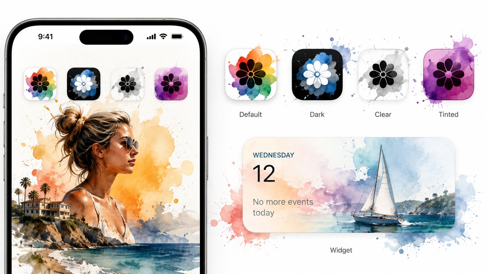
The screen stops looking assembled and starts looking edited. The icon appearance you choose changes the entire mood, because the same apps can read as playful, severe, glossy, or invisible depending on how you treat them. Widgets follow the same logic, which is why people who skip this stage end up with a wallpaper that looks expensive and a widget stack that looks like it came free with a phone contract.
Which icon appearance should you use
| Appearance | Look | Best for |
|---|---|---|
| Default | Standard Apple styling | People who want normal readability and zero drama |
| Dark | Icons and widgets shift to a darker treatment | Dark wallpapers and low-glare setups |
| Clear | Minimal, transparent-looking treatment | Users who want the wallpaper to stay visually dominant |
| Tinted | Everything leans into one chosen color | Cohesive, palette-driven setups |
Tinted is the workhorse if you want the whole screen to feel like one system. Dark works when your wallpaper is already moody and low-key. Clear is for the maximalists who want the wallpaper to do the talking while the icons behave like polite ghosts. And if you want a screen that changes character throughout the day without you babysitting it, Auto mode flips styling by time of day.
Apple also confirms that icon names disappear in the Large icon size, which is one of the fastest ways to get the clean, editorial look people keep chasing. That's the move if you want the screen to feel less like a utility drawer and more like a magazine spread that somehow still opens Maps.
If you're using a refurbished device and want one that'll hold up nicely for a visual-heavy setup, buy refurbished iPhones UK is a practical place to compare options before you start judging your own wallpaper choices like a tiny art director.
Cut the Clutter With One Page and the App Library
The home screen gets prettier the moment you stop trying to display every app you've ever downloaded. The visible page should hold the stuff you use, not the entire archive of your impulsive Tuesday decisions. Everything else can live in the App Library like a well-behaved relative who only appears at holidays.
A minimalist setup recommends a single page of icons, no folders, and setting Newly Downloaded Apps to App Library Only in Settings > Home Screen & App Library. That's not anti-organization. It's pro-surface-area. The more you hide from the main page, the calmer the composition becomes.
The cleanest practical layout
- Keep one home page visible. Anything more should earn rent.
- Hide extra pages by tapping the page dots in edit mode and unchecking the pages you don't want.
- Send new downloads to the App Library so fresh apps don't walk onto the stage uninvited.
- Use folders sparingly if you absolutely must, because folders are for retrieval, not visual poetry.
Spotlight and App Library search are quicker than scrolling anyway, so the "but how will I find anything" panic is mostly nostalgia for clutter. If you need an app often enough, it earns a visible spot. If not, it can live offstage and stop interrupting the composition.
The best-looking phone is usually the one that refuses to show off every app it owns. Very rude. Very effective.
Four Aesthetic Recipes You Can Copy Tonight
If you want a starting point without turning this into a six-hour identity crisis, copy one of these and make small adjustments later. The point is to reduce decision fatigue, not to build a new visual religion.
Lofi
Warm purples, soft glow, and one slightly nostalgic object in the wallpaper. Use Tinted icons and a simple widget or two, ideally something that doesn't scream for attention. This style works well with the synthwave aesthetic if you want the whole thing to lean a little more neon and a little less sleepy.
Cozy Winter
Off-whites, soft browns, snowy scenes, and icons that stay quiet. A light wallpaper with a muted tint makes the screen feel soft without becoming bland. If you want the desktop and lock screen on Mac to match later, the winter wallpaper collection is the obvious companion because the same visual language carries cleanly across devices.
Neon
Deep black or near-black wallpaper, one electric accent, and enough contrast to make the icons pop without shouting. This is the setup for people who enjoy midnight city energy and don't mind a little glow. Keep widgets minimal, because too many boxes kill the whole effect.
Dark Minimal
Near-black wallpaper, Clear or Tinted icons, and a single-line widget or two. This is the most forgiving setup if you want the screen to stay calm all day. It also hides the fact that half the apps on your phone are for things you used once and then emotionally moved on from.
Troubleshooting the Real Failure Modes
The first problem is always the same. One or two apps refuse to follow the tint treatment and keep their own styling like tiny rebels. Don't fight them forever. Put them in a folder, move them off the main page, or accept them as accent points and move on with your life.
The second problem is widgets that behave like decorative battery drains. If a widget animates, refreshes too often, or exists mainly to look busy, it usually earns its chaos points very quickly. Battery, calendar, and weather widgets tend to justify their space better than widgets whose main feature is "movement."
The third problem is the new app that lands on page one and ruins the composition like it pays half the rent. That's why the App Library setting matters, and why a weekly clear-out pass is not overkill. Once a week, remove the junk, re-check the layout, and stop pretending that visual order maintains itself out of respect.
Keep the screen honest: if a widget or app doesn't improve readability or usefulness, it's probably decorative clutter in a blazer.
Quick FAQ
Why do some icons still look different?
Because not every app obeys the same styling logic, and that's normal. Treat the stubborn ones as exceptions, not as a failed setup.
Should I use more widgets for a more aesthetic look?
No. Use only the widgets you'll glance at. A crowded screen looks busier, not better.
What if my wallpaper looks great but the icons don't?
The wallpaper is probably fine. The icon treatment or tint choice is the thing that needs work.
If you want the same kind of visual consistency on your Mac, gifPaper turns live wallpapers into a proper desktop and lock screen setup instead of another half-finished folder of downloads. It's a sensible move if your phone and Mac are supposed to feel like they belong to the same person.