How to Make Your Home Screen Aesthetic on Mac
You wake your Mac, stare at the lock screen for a second, then open a tab you didn't mean to open and call it "morning." The machine is already in your life more than your couch is, so pretending the desktop doesn't matter is a charming little lie. If you want how to make your home screen aesthetic without turning into a person who spends six hours arguing with a hex code, start where the eye lands first.
Most iPhone aesthetic advice stops at the phone and politely leaves Mac users holding the bag. That's silly, because the Mac desktop and lock screen are the surfaces you see while you answer messages, write, study, and hover near your caffeine source like a Victorian ghost. The fix here is simpler than it looks: wallpaper first, then everything else.
Why Your Mac Home Screen Is the Aesthetic Surface You Keep Ignoring
The first thing you see in the morning is usually the lock screen, not your immaculate taste in ceramics or the notebook you bought because it looked serious. Then the desktop opens, and there it is again, waiting while you pretend to be productive and type the same sentence three times. That makes the Mac a brutally honest aesthetic surface, one that sits in your peripheral vision for hours and doesn't care about your intentions.
Apple's iOS 14 update in September 2020 turned home-screen customization into a mainstream habit on iPhone, mainly by adding widgets and the app library, which made polished layouts much easier for ordinary people to build rather than only the power tweaker who owns twelve niche apps and a moral philosophy. But the Mac has become the bigger canvas in practice. It's the screen you live with, which is exactly why it deserves more attention than the tiny rectangle in your pocket.
Practical rule: if you spend more time looking at your Mac than your phone, the Mac wins the aesthetic contest by default. No medals. Just uptime.
Aesthetic home screens work because they're visual systems, not random decoration. The strongest setups coordinate wallpaper, widgets, icons, and spacing so the whole screen feels intentional instead of like a drawer exploded. That's the actual point here, and it's why Mac customization is where the good stuff happens.
The Three-Layer System That Makes a Home Screen Aesthetic

A polished setup usually lives or dies on three layers. The wallpaper sets the mood, the color palette keeps the screen from looking like it got dressed in the dark, and the icons decide whether the whole thing feels curated or chaotic.
Start with the wallpaper
Pick the wallpaper first because it sets the tone for everything else. If you want a calm setup, choose a background that already feels soft and quiet. If you want something more dramatic, go for a darker scene with strong contrast and let the icons sit on top like they know what they're doing.
Match the palette
Keep the total palette to no more than three colors for the whole screen, usually one base tone and two accents. That keeps the setup cohesive instead of looking like three different design decisions were made by three different people in the same meeting. Use the wallpaper colors as the anchor, then echo them in widgets and icon art.
Make icons behave
Icons should support the wallpaper, not wrestle it in a parking lot. If the screen has a bright background, use darker, cleaner icons. If the background is deep or moody, lighter icons usually read better, and the whole thing feels more deliberate.

Static Wallpapers vs Apple's Aerial vs Seamless Live Wallpapers
Static wallpapers are fine. They're predictable, they don't move, and they won't embarrass you in public. But they also stop at "nice picture," which is why so many setups feel a little like a framed print someone forgot to hang properly.
Apple's built-in Aerial wallpapers are a bigger deal because they're real video, not just a pretty still image with delusions of grandeur. The catch is obvious: Apple decides the catalog, which means you get the curated material Apple chose, not the exact vibe you wanted on a rainy Thursday. That's the trade-off, and it's a decent one if you like the stock selection.
Live wallpapers are the clean winner for aesthetic setups because they keep the motion without the ugly seam or the obvious loop. The point isn't motion for motion's sake—it's continuity. A loop that disappears into itself feels calm, while a clunky cut makes the whole screen look like it's being held together by enthusiasm and hope.
If you want to change the wallpaper on a Mac before messing with anything else, the wallpaper change process is straightforward: System Preferences > Desktop & Screen Saver. From there, the decision is simple. Static if you want zero fuss, Aerial if Apple's selection works for you, live if you want the most polished result.
Arranging Icons, Folders, and the Dock Without the Clutter
Aesthetic screens don't need a million apps on display. They need a main page that looks intentional when you're half-awake and a bit grumpy about email. A practical setup keeps the main page to roughly 20 to 25 apps, uses a 2×4 icon grid with a blank lower half, and leaves enough space that your wallpaper can still breathe.
Put the secondary mess somewhere else
Group related apps into folders with short, clear labels. Keep anything you don't open every day off the main page and shove it into an app library or a secondary page. That's not minimalism as performance art—it's just making the screen easier to read.
Useful rule: if an app doesn't earn its spot daily, it doesn't deserve prime real estate.
The dock should be even stricter. Leave only the apps you launch every day, the ones your hand finds before your brain wakes up and remembers names. If the dock has eight things in it, it's already arguing with the wallpaper.
Grid choice matters too. A 4×5 grid gives larger shortcuts, while a 5×6 grid fits more content, so pick the one that matches your tolerance for visual density. Most clean setups use the grid to create margin, not to fill every pixel like they're being paid by the icon.
Do a weekly sanity check
Once a week, look at the main page and remove whatever you haven't tapped. If a widget, folder, or app is just sitting there looking decorative and smug, it can leave. Clean screens survive because they stay honest.
Widgets That Look Good and Stay Scannable
Widgets are where a lot of aesthetic setups go to die of overcommitment. One or two widgets can make the screen feel designed. Seven widgets make it feel like a dashboard for a very stressed submarine.
The practical rule is simple: use small, medium, and large widgets on purpose, not at random, and keep it to one or two widgets max on the main screen. The nicest layouts use stacking when available, then hide the rest where they belong, off the front page like civilized adults.
Widget color should echo the same three-color palette from earlier. If the wallpaper is muted, don't drop in a neon weather block that looks like it escaped from a skate park. If you want widgets that feel practical and cohesive, stick with date, weather, calendar, battery—the stuff you glance at. Anything beyond that starts fighting the wallpaper for attention, and the wallpaper is the one paying rent.
Three Aesthetic Presets You Can Copy in One Sitting
A preset works because it gives you a finished taste profile instead of a blank page and a mild identity crisis. The easiest way to decide how to make your home screen aesthetic is to pick a vibe, then let the wallpaper do most of the heavy lifting.
Lofi study desk
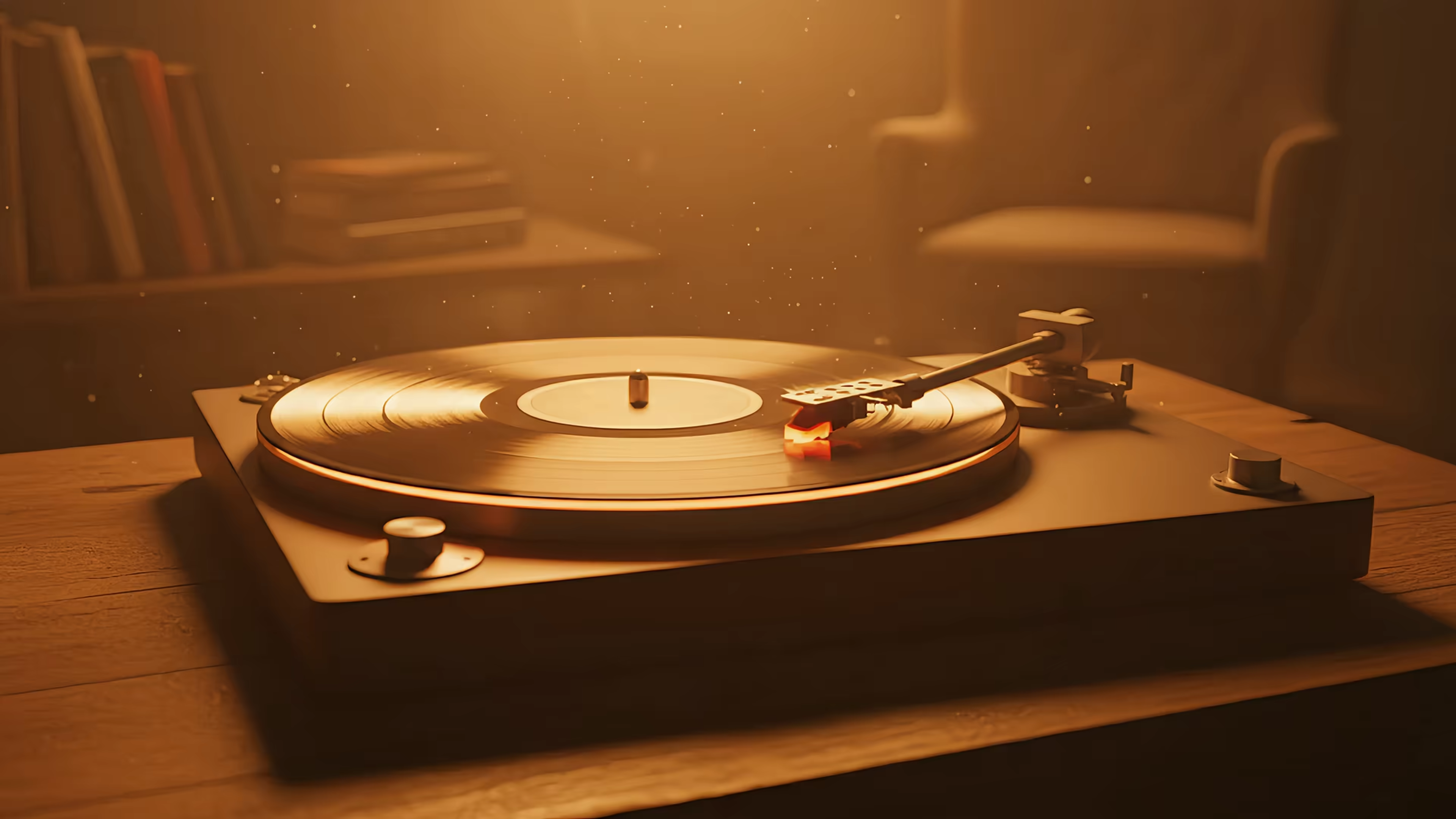
Go with a quiet desk scene, a train window, or something cozy and worn in. Use muted browns, cream, dusty blue, or soft green. Icons should be simple and low-contrast, and the widget choice should stay small—time and calendar, maybe one music widget if you're leaning into the vibe. This one works because it looks like concentration without trying to cosplay as productivity gospel.
Cozy winter cabin
Pick a fireplace, snow house, or dark wood scene. Use warm whites, deep pine, charcoal, and one amber accent. Keep icons clean and bright enough to read against the background, and use a single medium widget if you want the screen to feel inhabited without becoming busy. This is the one for people who want winter vibes without the actual cold, which is a noble and frankly intelligent goal.
Neon cityscape
Pick a purple, blue, or electric street scene. The mood should be glossy and a little ridiculous, like a synth track decided to become architecture. Use a dark base with one vivid accent, usually magenta or cyan, and keep the icons either monochrome or very restrained. A single widget is enough here because the wallpaper is already doing the dramatic work.
Fixing the Annoying Stuff and Picking Up Where Apple Stops
The annoying part is never the pretty part. The annoying part is the seam that shows up on a loop, the wallpaper crop that cuts off the best bit of the scene, and the lock screen that looks like it came from a different design universe. Apple gives you pieces of this, but it doesn't hand you the whole thing in one tidy box.
Seams and battery worries
If a live wallpaper loop looks choppy, the problem is usually the loop itself, not your standards. Use smooth footage, not a clip that obviously starts over like a stage actor forgetting their line. That same rule applies to battery concerns, because a wallpaper that feels smooth and deliberate is a lot less annoying than one that screams "video file" every time you wake the machine.
Scaling and lock screen mismatch
Retina scaling matters because a gorgeous wallpaper that crops badly is just expensive wallpaper with confidence issues. Choose footage or stills that hold up at the right aspect ratio, then test the lock screen and desktop together, not separately. A setup that looks great on the desktop but awkward on the lock screen is a setup that needs more editing, not more optimism.
A direct option if you want the whole thing handled
For readers who want the same live wallpaper on the lock screen, desktop, and screen saver in one action, gifPaper does that on Mac with Apple's native dynamic wallpaper format. It's a direct download, requires macOS 26 or later, comes with a 7-day free trial with no credit card, and costs $4.99 one time. If you want the setup path and the wallpaper in one place, the live wallpaper guide for Mac is the right companion.
If you want the clean version without the fiddly nonsense, gifPaper gives you smooth live wallpapers for your Mac lock screen, desktop, and screen saver in one shot. It's the neat answer for the exact problem this guide is obsessed with—making the Mac look intentional instead of like a pile of icons wearing a wallpaper. Try it, set one living scene, and let the machine stop looking like a filing cabinet with ambition.