1080i or 720p: What to Actually Choose in 2026
You buy a nice display, or plug your Mac into a TV, or fall into a settings menu that looks like it was designed during the reign of plasma. Then it asks a cursed little question: 1080i or 720p?
Reasonable reaction: why is a format war from the Bush administration still alive, shambling around my desk setup like a technical zombie?
Less reasonable but correct reaction: because your screen can still look worse than it should if you pick the wrong one.
This matters most when you're looking at motion for long stretches. Broadcast TV. Sports. Old set-top boxes. Captured footage. Ambient loops. Video wallpapers. Anything that moves slowly enough to seem simple, yet fast enough to reveal ugly processing the second your display has to guess what half the picture was supposed to be. Your expensive Mac is many things, but a miracle worker isn't one of them.
A Tech Debate From 2005? On My Mac?
A lot of people run into this while doing something aggressively normal. You connect a MacBook to an older TV in the guest room. You rescue a monitor from storage because it still technically works. You open a display menu and get hit with 720p, 1080i, maybe some wildly specific option that feels like it was added by a bored broadcast engineer.

The confusion is fair. In a world of Retina displays and 4K everything, this should feel irrelevant. Instead, it keeps showing up in exactly the places where picture quality gets weird. Older televisions. Broadcast sources. Cheap adapters. Console-era settings menus. That one AV receiver nobody wants to replace because it still has "great sound."
Why this still bites
The old 1080i or 720p question still matters because the wrong choice doesn't usually fail in an obvious way. Your screen still shows an image. It just shows a slightly softer, twitchier, more artifact-riddled image. The sort of problem you notice only after an hour, when your eyes start filing a complaint.
A few modern use cases where this still matters:
- Old TV as a second display: The panel may prefer one signal and punish the other.
- Broadcast and sports feeds: Motion handling changes more than the headline resolution suggests.
- Ambient video on a large screen: Slow panning lights, snowfall, rain, and fire expose bad processing surprisingly fast.
- Mac-to-TV setups: Your output choice and the TV's own scaling can combine into one big visual shrug.
Practical rule: If a format choice still appears in your setup, it's not decorative. One of those options will usually look better on your specific display.
The annoying part is that there isn't one universal winner. Film and slower content lean one way. Fast motion often leans another. And if your display has to rescale everything anyway, the answer gets even more personal.
What 1080i and 720p Actually Mean
The numbers are the easy part. 720p means 1280x720. 1080i points to 1920x1080, but that's where the simplicity goes outside for a cigarette.
Here's the blunt version in table form.
| Format | Resolution | How it draws the image | Best known for | Main catch |
|---|---|---|---|---|
| 720p | 1280x720 | Progressive | Smooth motion | Fewer total pixels |
| 1080i | 1920x1080 | Interlaced | Higher apparent detail in some slower content | Interlacing artifacts and motion issues |

The letter matters more than the number
The p means progressive scan. The display gets a full frame in order, top to bottom. Every line belongs to the same moment in time.
The i means interlaced. Instead of drawing the whole frame at once, it draws alternating lines, then fills in the missing ones in the next pass. The process involves sketching every other line of a picture, then returning to add the gaps. That saved bandwidth back when bandwidth was expensive and everyone was making compromises with gritted teeth.
The pixel math makes 1080 look superior at first glance. A 1080p image holds 2,073,600 pixels, while 720p holds 921,600 pixels, which means 1080p contains 2.25x more pixel data according to this resolution breakdown from The Catalyst Companies. But 1080i doesn't deliver that data the same way 1080p does. At any given moment, it only shows 540 lines.
Why these two ended up fighting in the first place
Broadcast history made this mess. 1080i became the top broadcast standard for television for a very long time, while 1080p stayed associated with physical media and later streaming, as summarized in this broadcast-format overview. So a whole generation learned that "1080" meant premium, even when the delivery method had strings attached.
That's also why this topic keeps resurfacing in video workflows outside television. If you work with property walkthroughs, listing reels, or any footage where motion and clarity have to coexist, it's worth learning how formats behave before you export something your display has to untangle.
Interlaced video isn't fake HD. It's compromised HD. Sometimes that compromise is acceptable. Sometimes it makes motion look like it lost a bar fight.
The Difference You Can See Motion and Artifacts
Static screenshots flatter 1080i. Motion is where the argument gets rude.
A still frame can make interlaced video look detailed enough. Then the camera pans, or a player sprints across the field, or diagonal edges slide through the frame, and suddenly you get that classic mess: soft motion, combing, feathering, or a faint tearing look around moving objects.

What ugly looks like in plain English
If you've never heard the term interlacing artifact, don't worry. You've probably seen one.
Common signs:
- Combing on motion: Fast-moving edges look split into little horizontal teeth.
- Feathering on diagonals: Panning shots can make slanted lines look fuzzy or fringed.
- Softness during movement: The image looks sharp only when everything politely stops moving.
By contrast, 720p sends full progressive frames. In broadcast use, 720p delivers 59.94 fps, while 1080i runs at 29.97 fps with 59.94 fields, and 720p avoids the "feathering" that can show up on diagonal edges during panning shots, as discussed in this VideoHelp thread on 1080i vs 720p.
Why ambient visuals expose this faster than you'd think
People assume artifacts only matter for sports. Not true. Slow, atmospheric motion can make them more obvious because there's less chaos to hide them.
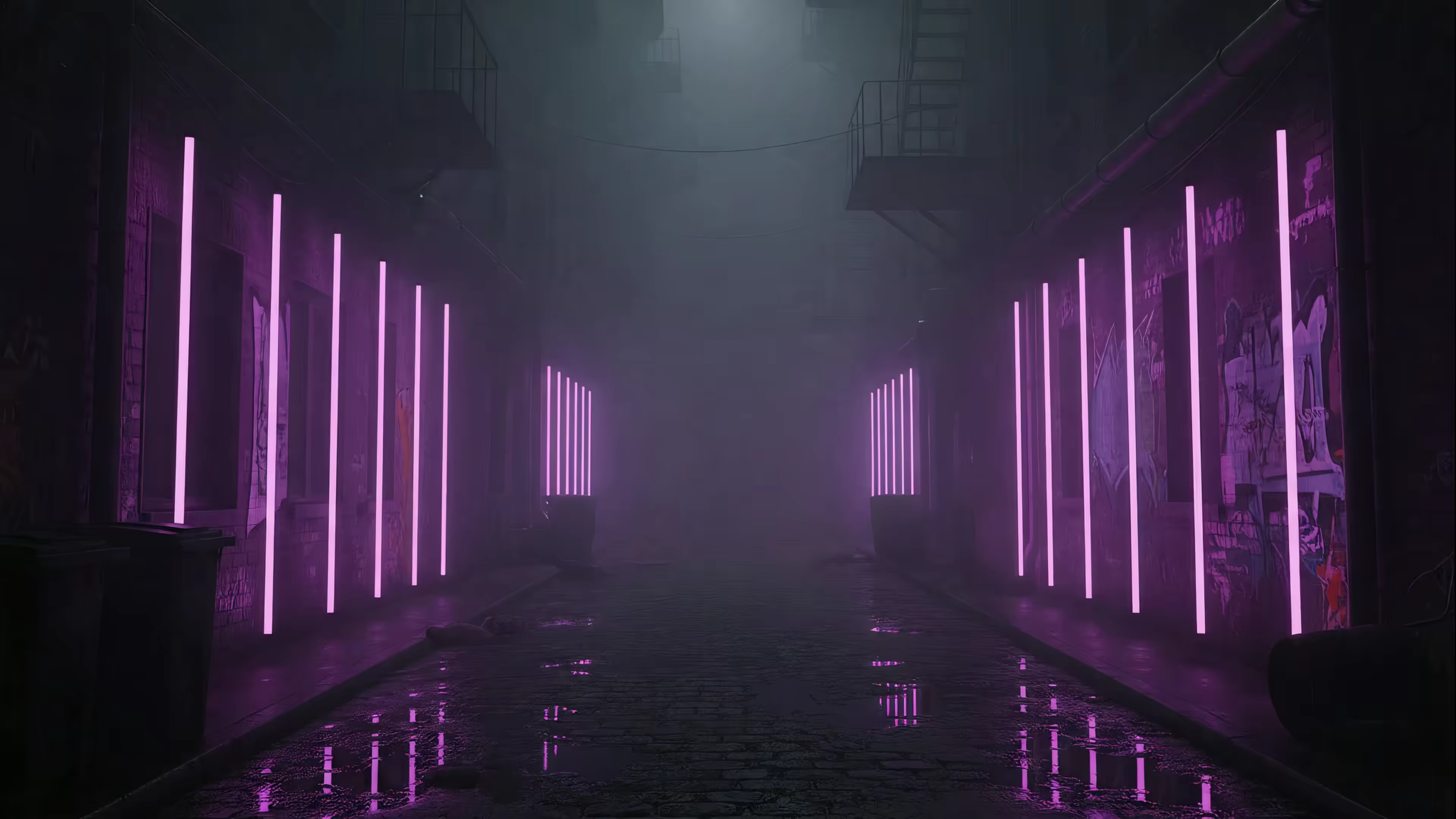
Rain in a neon alley. Firelight. Falling snow. Gentle camera drift over a scenic view. Those scenes should feel smooth. If the source is interlaced or poorly deinterlaced, you start noticing edge shimmer and motion weirdness that turns "cozy" into "why does this look slightly haunted?"
A practical shortcut helps here:
- For fast action, progressive delivery usually looks cleaner.
- For slow cinematic footage, interlaced sources can look acceptable if the display handles them well.
- For looping visual ambience, progressive is the safer bet because subtle artifacts become repetitive, and repetition makes flaws loud.
If a moving image looks fine only when paused, the format is doing you no favors.
The Pixel Count Lie Why Bigger Isn't Better
People see 1080 and assume the argument is over. Bigger number. More detail. Tiny victory parade.
Not so fast.
Motion beats bragging rights
The best format depends on what you're watching. For film sources, 1080p can often be extracted from a 1080i signal with zero loss. For fast-action content like sports or gaming, 720p at 60fps produces sharper action clarity than 1080i because it avoids interlacing artifacts, according to this VideoHelp discussion on content-type tradeoffs.
That explains why the old broadcast split made sense. Some networks favored motion clarity. Others favored the higher apparent detail of 1080i for slower material. Neither side was insane. They were solving different problems with the tools they had.
The number on the box isn't the whole experience
This is why "more pixels" is a half-truth. Viewing distance matters. Screen size matters. Processing matters. If you're comparing formats on a TV setup, these optimal viewing distance tips are useful because perceived sharpness changes with how far away you're sitting, not how heroic the spec sheet sounds.
For Mac users, this becomes extra funny because you're often much closer to the screen than TV people assume. A flaw that disappears across the living room can become very visible at desk distance.
If you want a broader primer on high-resolution desktop visuals, this guide to hi-res Mac wallpaper is worth reading. It gets into why source quality and scaling matter more than raw labels.
A simple way to think about it:
- Movies and slower drama: 1080i can hold up if the chain handles it properly.
- Sports and games: 720p often looks better because motion stays cleaner.
- Desktop video and ambience: Consistency matters more than theoretical detail.
The pixel count lie is that image quality is one number. It isn't. It's a stack of compromises wearing a nametag.
Why This Matters For Your 4K Retina Display
Modern displays are spoiled. They expect clean input. Feed them old interlaced material and they have to do restoration work before they can even start showing off.
That's where the 1080i or 720p question gets weirdly relevant on a Mac. Your laptop screen isn't just displaying the image. It's often scaling it, sharpening it, and trying to hide whatever nonsense came in.

Native resolution matching is the trap nobody mentions
A critical issue here is native resolution matching. Many displays don't match either incoming format perfectly. Some older HDTVs didn't even support 720p at all, and many panels use native resolutions like 1366x768, which means they upscale or downscale everything anyway, as noted in this ResetEra discussion of native resolution matching.
That matters because a progressive source survives this abuse better.
A clean 720p image can be scaled up in a relatively straightforward way. A 1080i image often needs deinterlacing first, then scaling. If the display or software guesses wrong, you don't get "more detail." You get enlarged mistakes.
Bigger garbage is still garbage
This is the core Retina problem. High-density screens are unforgiving. They don't magically improve weak source material. They reveal it.
A useful mental model:
- Progressive source: The display scales a complete picture.
- Interlaced source: The display reconstructs a picture, then scales it.
- Bad reconstruction: Every flaw gets promoted to management.
If you are working with any kind of motion graphics, wallpaper loops, or screen-based visual presentation, these notes on how to improve your digital content quality are helpful because they reinforce the boring but essential point that source quality decisions ripple all the way to the final screen.
Mac users dealing with wallpaper cropping and resolution mismatches should also read this guide on MacBook wallpaper size. It helps explain why a file that seems "high enough resolution" can still look off once the display starts scaling and positioning it.
On a Retina display, 1080i doesn't fail gracefully. It fails in high definition.
The Verdict What To Choose For Your Mac Gaming and TV
Here's the short answer people usually wanted from the beginning.
If you're choosing between 1080i or 720p, pick based on the content and the display, not on ego.
For TV and film
If the source is slower, cinematic, or film-based, 1080i can be fine. It can preserve strong apparent detail, and film-origin material often behaves better than live motion. This is the one case where 1080i gets to wear a respectable jacket.
Still, "fine" depends on the display doing competent deinterlacing. Some do. Some absolutely do not.
For sports and gaming
Pick 720p.
Fast motion likes progressive frames. Sports broadcasts were the classic example, but the logic holds for games and anything else with quick movement across the screen. Motion clarity is usually more valuable than winning a static resolution argument nobody can see once the camera starts moving.
For streaming and desktop video
Pick progressive whenever possible.
In modern use, the cleanest workflow is simple. Avoid interlaced sources unless you're forced to use them. If a service offers progressive output, take it. If a capture or archive is interlaced, deinterlace carefully before asking a high-resolution display to make it bigger.
For a Mac connected to a TV or old monitor
Test both, then keep the one your display likes.
That sounds annoyingly non-absolute, but it's the honest answer. Some sets prefer 720p because the panel handles progressive scaling better. Some look acceptable with 1080i for slower content. If motion looks soft, jittery, or fringed, switch to 720p and stop pretending the larger number deserves loyalty.
If your setup also involves refresh rate quirks, scaling weirdness, or game performance questions, this guide to monitor performance on Mac is a useful companion.
The practical verdict is boring, which is how you know it's true. Choose 720p for motion. Accept 1080i only when the content is slower and the display handles it well. On modern Macs and high-density screens, progressive sources are the safer, cleaner choice.
If you're going to stare at your Mac for hours, it might as well show something better than a static blob stretched across a very expensive screen. gifPaper is a Mac app for live wallpapers on your desktop, lock screen, and screen saver, using Apple's native Aerial format instead of the usual hacky overlay nonsense. You can browse the site's neon wallpapers if you want rain-soaked city glow, or the fireplace wallpapers if your taste runs more toward "cabin in the woods, but with Wi-Fi." The app itself is a $4.99 one-time purchase, has a 7-day free trial with no credit card required, and includes a 30-day money-back guarantee on gifPaper for Mac.