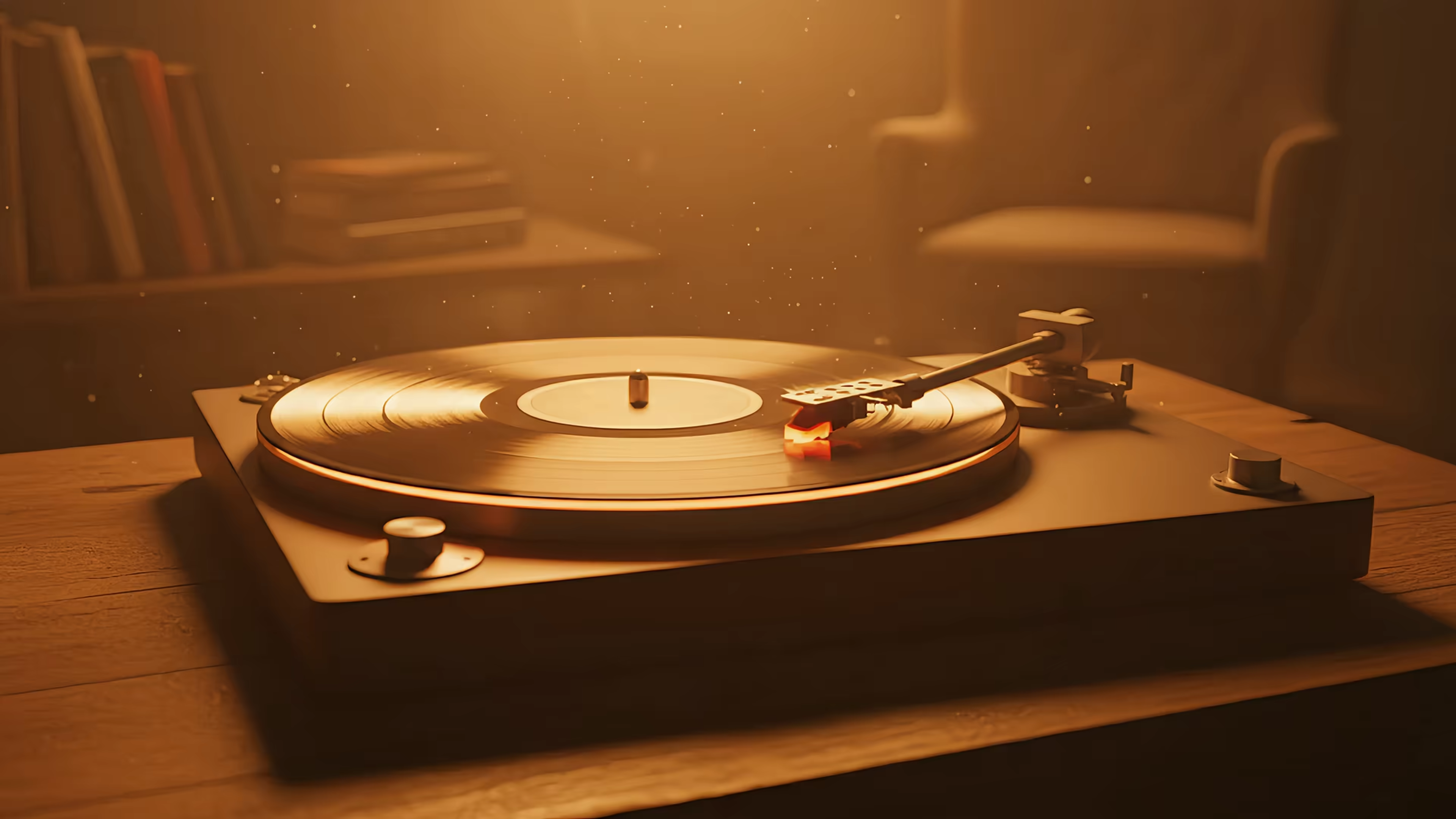
A Different Perspective: Best Mac Live Wallpapers in 2026
You're probably looking at it right now.
A default mountain. A nice gradient. The sort of wallpaper chosen by a committee of polite ghosts. It isn't ugly. It's just spiritually unemployed.
That matters more than people admit. Your desktop isn't decoration in the same way a throw pillow is decoration. It's the frame around hours of attention, the stage set behind email, notes, browser tabs, and those moments when you stare into the middle distance pretending to think. A different perspective sounds like something printed on a mug in a dentist's office. On a screen, it's literal. Change the frame, and the room in your head changes with it.
Your Desktop Is a Place Not a Picture
Open your Mac on a Monday morning and the difference hits within seconds. One wallpaper makes the screen read like a bulletin board someone forgot to finish. Another gives the eye a horizon line, a sense of distance, a place for attention to settle before the tabs begin multiplying like bad plot twists.
That difference matters because a desktop is not just an image sitting behind your files. It is the visual environment that frames your work. In film, the set is never mere backdrop. A hallway can feel claustrophobic, a window can suggest escape, and a room shot from the corner can make a character look isolated before anyone says a word. Your Mac screen works the same way, only the actor is your attention.
The background is doing composition work
A wallpaper tells your brain how to read space. Some backgrounds behave like a flat wall. Icons pile onto them, windows feel heavier, and the whole screen becomes a surface to manage. Others create implied depth, directional light, or a point of view. The desktop starts to feel less like storage and more like a place you enter.
That sounds suspiciously artsy until you watch it happen.
A street scene shot from a low angle pulls the eye forward. A quiet interior with a lamp in the corner creates a stable resting point. An expansive view with foreground, middle ground, and distance gives your windows room to sit without looking stranded. These are old visual tricks. Painters used them. Cinematographers refined them. Wallpaper design borrows them for the humble job of making your workday feel less visually dead.
Here is the useful version:
- A wall makes the screen feel closed off
- A window adds visual breathing room
- A room gives the desktop mood and orientation
- A portal begins when motion and sound add time, not just space
Many desktops still live somewhere between wall and spreadsheet.
If you have already cleaned up cables, chosen a good lamp, and stopped letting random objects colonize your desk, the screen deserves the same level of intention. Blu Monaco minimalist setup tips cover the physical side well. The same principle applies digitally. Clear the clutter, choose a focal point, and let the eye know where to rest.
"Perspective" here is also literal, which is a nice break from hearing it used as advice from ceramic mugs. A wallpaper with a viewpoint, depth cues, or implied motion does more than look attractive. It frames your desktop psychologically. It can make work feel boxed in, open-ended, calm, or gently kinetic.
For a practical version of that idea, this guide to MacBook wallpaper aesthetics shows how the image behind your apps shapes the feeling of the whole screen. Your desktop is a place you return to dozens of times a day. It should behave like one.
Why a Small Visual Shift Feels So Big
Tiny changes often act ridiculous. They should feel minor, but they don't. Move one lamp in a room and suddenly the room has opinions. Change the color temperature on a monitor and your entire desk seems to have become more serious about spreadsheets.

There's a useful analogy from probability. The Birthday Paradox explained by Business Insider shows that with just 23 people, there's a 50% chance two share a birthday. That's the kind of fact people reject on instinct because the gut is a charming idiot. The lesson isn't about cake. It's about systems. Small setups can create surprisingly large effects.
Why the eye overreacts, in a good way
Your desktop is a system. Menu bar, dock, app windows, empty space, color, contrast, implied depth, motion. Change one element and the whole composition shifts. A wallpaper doesn't live in isolation. It changes how every icon and window sits in space.
That's why "it's only a wallpaper" misses the point. It's only a wallpaper in the same way lighting is only a bulb. Technically true. Emotionally useless.
A different perspective often feels larger than the object that caused it.
Three reasons this happens:
-
The desktop is repeated exposure
You don't see it once. You see it constantly, in fragments, all day. -
The background sets context
A calm scene can make busy windows feel less boxed in. A cramped image can make even a clean setup feel crowded. -
Mood loves shortcuts
The brain uses visual cues shamelessly. Give it depth, warmth, or movement, and it starts making inferences before you've opened a single app.
The result is counterintuitive, which is why people underestimate it. They expect a wallpaper to be cosmetic. Then they change it and the machine feels different to use. Not because the processor became poetic, but because attention is fussy and visual framing gets to it first.
A Crash Course in Visual Perspectives
Most wallpaper advice stalls out at color. Dark for focus. Light for clarity. Purple if you enjoy neon melancholy and excellent bad decisions. Useful, but incomplete. Perspective does more than palette. It tells the eye how to move.

Aerial and macro
An aerial perspective places you above the scene. Think city lights from a high vantage point, a road disappearing into weather, or a forest seen from overhead. It feels expansive. Your windows look smaller inside it, which can be helpful if your task list has begun to behave like a Victorian novel.
A macro perspective does the opposite. It puts you very close to texture or detail. Rain on glass. Flame. Leaves moving near the lens. This creates intimacy. It narrows attention and makes the screen feel less like a public square and more like a nook.
Both work because they control psychological distance.
| Perspective | What it tells the eye | What it tends to feel like |
|---|---|---|
| Aerial | Look outward | Spacious, strategic, open |
| Macro | Look closely | Focused, tactile, intimate |
One-point and two-point depth
Then you get to the geometry teachers warned you about. One-point perspective draws the eye toward a single vanishing point. Hallways, roads, tunnels, train tracks. Very orderly. Very good at making the desktop feel deeper than it is.
Two-point perspective is more dynamic. A two-point perspective lesson notes that it uses two vanishing points on the horizon line, and that the distance between those points is inversely proportional to the viewer's perceived distance from the object, which lets designers manipulate depth on a 2D screen. In human language, moving those invisible points changes how dramatic the space feels.
If the geometry sounds dry, here's the useful version:
- Wide vanishing points feel steadier and less distorted
- Closer vanishing points exaggerate angle and depth
- Good wallpaper composition leaves visual breathing room for icons, the dock, and open windows
Design note: Depth works best on a desktop when it sits behind the interface instead of fighting it.
Often, wallpapers fall short. They may be attractive in isolation, then become chaotic once menus and folders arrive like uninvited cousins.
Tilt and deliberate unease
A Dutch angle, or tilted frame, can create tension or energy. In cinema it often signals instability, menace, or a director who has recently discovered symbolism. On a desktop, a strong tilt can feel active and dramatic, but it can also become tiring if every glance suggests the room is sliding off the table.
For everyday use, the best wallpapers usually borrow from film language without shouting it. Enough perspective to imply place. Enough depth to separate interface from scene. Not so much theatricality that checking calendar events feels like the opening of a thriller.
How Motion and Sound Create a Portal
A still image can suggest a place. Motion makes the suggestion harder to ignore.
That's the difference between a photo of rain and a loop where the rain keeps falling. One says, "this exists." The other says, "you are here now." It's a modest illusion, but a good one. Cinema has survived for quite a while on exactly that trick.

Seamless motion changes the category
The key word is unbroken. If a loop hiccups, your brain catches the seam and the spell collapses. If it loops cleanly, the image stops feeling like a clip and starts feeling like ambient presence. Fire flickers. Snow falls. A train window rolls by. You don't watch it the way you watch content. You coexist with it.
That distinction matters. A desktop shouldn't beg for attention every ten seconds like a toddler with a tambourine.
Three things make motion useful instead of annoying:
- Subtle repetition keeps the scene alive without becoming performance
- Stable composition lets your apps stay legible over the scene
- Slow pacing supports attention instead of stealing it
Sound makes the place believable
Ambient audio adds the missing half of the illusion. Not a soundtrack in the cinematic sense. More like environmental evidence. Crackling fire, rain, distant room tone, soft transit rhythm. Suddenly the wallpaper isn't just visible. It has atmosphere.
A fireplace with no sound is a picture of warmth. A fireplace with gentle crackle is closer to a room. All the cozy, none of the smoke damage.
If you want the audio side of this idea without turning your workspace into a nightclub for moss, this piece on ambient music for studying is a sensible companion. Sound works best when it behaves like architecture, not performance.
The best moving wallpapers don't ask to be watched. They reward being glanced at.
That's why motion and sound together can create a different perspective in a more literal way than static art can. They don't just alter appearance. They alter presence.
Examples from the Gallery
A gallery is where theory has to behave itself. If perspective, depth, and presence matter on a desktop, they should show up in actual scenes, not just in lofty prose borrowed from film school.

What follows is less about subject matter than point of view. Winter, fire, and lofi all work for different reasons, but the useful question is the same in each case. Where does the screen place you?
A fixed cozy viewpoint
snow house in the winter wallpaper gallery succeeds because it gives your eye a stable home base. The lit house acts like an anchor in the frame, and the surrounding snow pushes outward in readable layers. That creates a mild sense of shelter, which is a very effective trick for a machine otherwise devoted to deadlines, tabs, and small indignities.
The broader winter wallpaper collection shows the same principle again and again. Good winter scenes are not just cold pictures. They are spatial pictures. You feel indoors looking out, or just outside looking in. That distinction is small on paper and large on a screen.
If you want to try one of these setups yourself, this guide on how to get live wallpapers on Mac covers the practical part.
Fire as close-range framing
A fireplace scene does nearly the opposite. Instead of opening the frame into distance, it pulls the frame inward. In cinematography terms, it behaves like a close study of texture and glow. On a desktop, that narrower visual field can calm the screen because it replaces far-off scenery with a local source of light.
The fireplace wallpaper collection is useful for days when expansive scenery feels a bit too optimistic. Fire gives you proximity. The desktop feels less like a window and more like a corner of a room, which is often better for concentrated work.
Lofi and the seated observer
Lofi scenes usually place the viewer in a chair, by a window, near a desk, inside a train carriage. That matters. The camera position is not drifting around showing off. It is settled, as if the wallpaper has already found the posture you were hoping to borrow.
The lofi wallpaper collection works well because it treats the Mac screen as a stage for quiet identification. You are not looking at an image. You are occupying its vantage point. For wallpapers, that is the whole trick. A small shift in perspective changes the psychological frame of the desk itself.
Get a New Perspective on Your Mac in One Click
Apple gives you a few lovely moving wallpapers. Then it stops short of letting you do much with the idea yourself. That's the irritating part. The visual language is right there, but the door is only half open.
Other wallpaper apps often feel bolted on. Fine for a novelty desktop. Less fine if you care about the lock screen behaving properly, or if you'd rather not jury-rig your computer into looking like a kiosk at a futurist yogurt shop. If you need the practical setup side first, this guide on how to get live wallpapers on Mac covers the basics.
What matters in an actual Mac wallpaper app
The feature list that matters is short:
- Native lock screen support so the wallpaper belongs to the system, not a fake layer floating on top
- Simple desktop control with the choice of a still frame or full animation
- Screen saver support because, against all odds, screen savers have become cool again
- Retina-friendly video quality so detail looks intentional, not smeared
And then there's the offer, which is refreshingly untheatrical.
| Detail | What you get |
|---|---|
| Price | $4.99 one-time purchase |
| Trial | 7-day free trial, no credit card required |
| Refunds | 30-day money-back guarantee |
| System | macOS 26 Tahoe or later |
It's direct download only because Apple's App Store sandboxing gets in the way of live lock screen wallpapers. The app is notarized by Apple, which is the sort of sentence nobody frames on a wall, but it does matter.
A different perspective doesn't need to be mystical. Sometimes it's just better framing, a bit of motion, and a screen that stops feeling dead the moment you wake the machine.
If you want the practical version of all this, gifPaper is the Mac app built for it. It sets live wallpapers on your lock screen, desktop, and screen saver using Apple's native Aerial format, not a clunky overlay. There's a 7-day free trial, it's $4.99 once, and yes, that's a real one-time price, not a subscription in a fake mustache. Browse the gallery if you like, then grab gifPaper for Mac when you're ready to make your screen feel like a place.